Designsystem
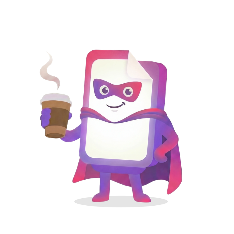
Coby-illustrationer
26 assets · PNG
Fargpalett
Klicka pa en farg for att kopiera.
Lilla – primærfarge
Primær merkefarge for handlingsknapper og interaktive elementer
50
#F7F3FF
purple-50
100
#EBE0FF
purple-100
200
#D6C2FF
purple-200
300
#C2A3FF
purple-300
400
#AD85FF
purple-400
500
#9966FF
purple-500
600
#7A52CC
purple-600
700
#5C3D99
purple-700
800
#3D2966
purple-800
900
#1F1433
purple-900
Rosa – sekundærfarge
Sekundær aksentfarge for høydepunkter og visuell interesse
50
#FFF2F6
pink-50
100
#FFDEEA
pink-100
200
#FFBDD5
pink-200
300
#FF9CC0
pink-300
400
#FF7AAB
pink-400
500
#FF5996
pink-500
600
#CC4778
pink-600
700
#99355A
pink-700
800
#66243C
pink-800
900
#33121E
pink-900
Dyp blå – varme nøytraltoner
Varme gråtoner som grunnlag for designsystemet
50
#FAF9F4
deep-blue-50
75
#F4F2EB
deep-blue-75
100
#EDEAE1
deep-blue-100
200
#E8E6DE
deep-blue-200
300
#D4D1C7
deep-blue-300
400
#A8A59B
deep-blue-400
500
#7C7970
deep-blue-500
600
#5C5950
deep-blue-600
700
#3D3B35
deep-blue-700
800
#2A2925
deep-blue-800
900
#1A1918
deep-blue-900
Bakgrunder
Cream
#FAF9F4
bg-cream
Hovedbakgrunn for sider
Cream dark
#F4F2EB
bg-deep-blue-75
Vekslende seksjonsbakgrunn
Cream footer
#E5E2D9
bg-cream-footer
Footer-bakgrunn
Utokad palett
Annu inte implementerad som Tailwind-klasser.
Sage
#7A9E75
Rose
#C97A8C
Blue
#7088AA
Terracotta
#B8907E
Moss
#6B8B6B
Oat
#D4C5B0
Lavender
#9B8FA8
Coral
#E8956F
Sky
#A8C5DD
Morka sektioner
Rubrik i mork sektion
text-white
Brodtext i mork sektion.
text-deep-blue-300
border-deep-blue-800
Navbar-integration: data-dark-section attributet vaxlar navbaren till ljust lage.
Typografi
Baloo 2 for rubriker, Open Sans for brodtext. Responsiv skalning.
Baloo 2 – rubriker
The quick brown fox jumps over the lazy dog
Open Sans – brodtext
The quick brown fox jumps over the lazy dog
Typografiskala
Display Heading
h1
clamp(2.25rem, 7vw, 5rem)
1.05
800
Large Heading
h2
clamp(1.875rem, 4vw, 2.5rem)
1.15
700
Medium Heading
h3
clamp(1.5rem, 3vw, 1.875rem)
1.25
700
Section Heading
h4
1.25rem
1.3
700
Subsection Heading
h5
1.125rem
1.4
700
Small Heading
h6
1rem
1.2
700
Lead paragraph text for introductions and emphasis
lead
1.125rem
1.7
400
Body text for main content and paragraphs
body
1rem
1.6
400
Small text for captions and supporting information
small
0.875rem
1.5
400
CAPTION TEXT
caption
0.75rem
1.4
600
Avstand & layout
Containerbredder
max-w-7xlExtra stor (80rem / 1280px)max-w-6xlStor (72rem / 1152px) – standardmax-w-5xlMedium (64rem / 1024px)max-w-4xlLiten (56rem / 896px)max-w-2xlExtra liten (42rem / 672px)Sektionspadding
py-12 md:py-24STANDARD48px mobil → 96px desktop
py-16 md:py-2864px → 112px
Innehallstunga sektioner
py-16 md:py-3264px → 128px
CTA-sektioner med extra andrum
Horisontell padding
px-6 sm:px-8 lg:px-12Containerpadding (responsiv)
24px mobil → 32px surfplatta → 48px desktop
p-6 md:p-10Kortpadding
24px mobil → 40px desktop
Skuggor
Varma, subtila skuggor som skapar djup.
Grunnleggende skygge
shadow-warm0 4px 6px -1px rgba(26, 25, 24, 0.08), 0 2px 4px -2px rgba(26, 25, 24, 0.04);
Stor skygge
shadow-warm-lg0 10px 25px -5px rgba(26, 25, 24, 0.1), 0 8px 10px -6px rgba(26, 25, 24, 0.06);
Ekstra stor skygge
shadow-warm-xl0 20px 40px -10px rgba(26, 25, 24, 0.12), 0 10px 20px -8px rgba(26, 25, 24, 0.08);
Komponenter
Knappar
Button
6 varianter, 3 storlekar.
Primary
Secondary
Outline
Ghost
Primary Light
Outline Light
Animationer
Blob-animasjon
animate-blobVaraktighet: 20s
Sakte rotasjon
animate-spin-slowVaraktighet: 60s
Sveve
animate-floatVaraktighet: 6s
Overgangsfunktioner
transition-organic // cubic-bezier(0.16, 1, 0.3, 1)btn-scale // Hover: scale(1.03), Active: scale(0.98)