Design System
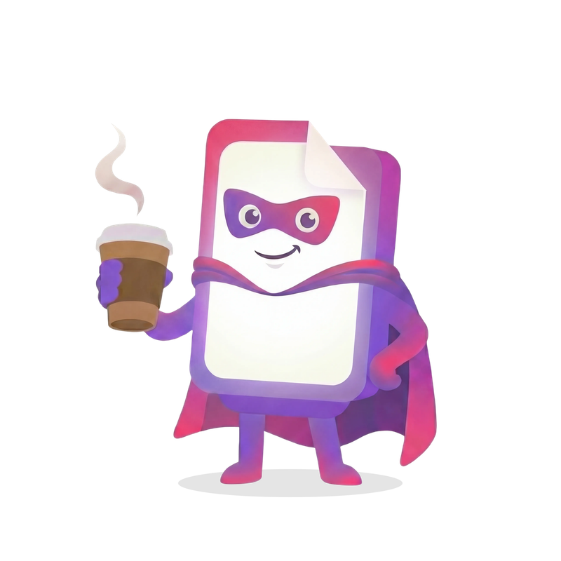
Coby illustrations
26 assets · PNG
Color palette
Click a color to copy.
Purple – primary color
Primary brand color for call-to-action buttons and interactive elements
50
#F7F3FF
purple-50
100
#EBE0FF
purple-100
200
#D6C2FF
purple-200
300
#C2A3FF
purple-300
400
#AD85FF
purple-400
500
#9966FF
purple-500
600
#7A52CC
purple-600
700
#5C3D99
purple-700
800
#3D2966
purple-800
900
#1F1433
purple-900
Pink – secondary color
Secondary accent color for highlights and visual interest
50
#FFF2F6
pink-50
100
#FFDEEA
pink-100
200
#FFBDD5
pink-200
300
#FF9CC0
pink-300
400
#FF7AAB
pink-400
500
#FF5996
pink-500
600
#CC4778
pink-600
700
#99355A
pink-700
800
#66243C
pink-800
900
#33121E
pink-900
Deep blue – warm neutrals
Warm grey tones as the foundation of the design system
50
#FAF9F4
deep-blue-50
75
#F4F2EB
deep-blue-75
100
#EDEAE1
deep-blue-100
200
#E8E6DE
deep-blue-200
300
#D4D1C7
deep-blue-300
400
#A8A59B
deep-blue-400
500
#7C7970
deep-blue-500
600
#5C5950
deep-blue-600
700
#3D3B35
deep-blue-700
800
#2A2925
deep-blue-800
900
#1A1918
deep-blue-900
Warm – terracotta
Warm terracotta accents for energy and warmth
50
#FEF5F2
warm-50
100
#FDE5DC
warm-100
200
#FBCFBE
warm-200
300
#F7AB93
warm-300
400
#EF8868
warm-400
500
#D7724F
warm-500
600
#C46849
warm-600
700
#A65639
warm-700
800
#7D3F2A
warm-800
900
#522921
warm-900
Backgrounds
Cream
#FAF9F4
bg-cream
Main page background
Cream dark
#F4F2EB
bg-deep-blue-75
Alternating section background
Cream footer
#E5E2D9
bg-cream-footer
Footer background
Extended palette
Not yet implemented as Tailwind classes.
Sage
#7A9E75
Rose
#C97A8C
Blue
#7088AA
Terracotta
#B8907E
Moss
#6B8B6B
Oat
#D4C5B0
Lavender
#9B8FA8
Coral
#E8956F
Sky
#A8C5DD
Dark sections
Heading in dark section
text-white
Body text in dark section.
text-deep-blue-300
border-deep-blue-800
Navbar integration: data-dark-section attribute switches the navbar to light mode.
Typography
Baloo 2 for headings, Open Sans for body text. Responsive scaling.
Baloo 2 – headings
The quick brown fox jumps over the lazy dog
Open Sans – body text
The quick brown fox jumps over the lazy dog
Typography scale
Display Heading
h1
clamp(2.25rem, 7vw, 5rem)
1.05
800
Large Heading
h2
clamp(1.875rem, 4vw, 2.5rem)
1.15
700
Medium Heading
h3
clamp(1.5rem, 3vw, 1.875rem)
1.25
700
Section Heading
h4
1.25rem
1.3
700
Subsection Heading
h5
1.125rem
1.4
700
Small Heading
h6
1rem
1.2
700
Lead paragraph text for introductions and emphasis
lead
1.125rem
1.7
400
Body text for main content and paragraphs
body
1rem
1.6
400
Small text for captions and supporting information
small
0.875rem
1.5
400
CAPTION TEXT
caption
0.75rem
1.4
600
Spacing & layout
Container widths
max-w-7xlExtra large (80rem / 1280px)max-w-6xlLarge (72rem / 1152px) – defaultmax-w-5xlMedium (64rem / 1024px)max-w-4xlSmall (56rem / 896px)max-w-2xlExtra small (42rem / 672px)Section padding
py-12 md:py-24STANDARD48px mobile → 96px desktop
py-16 md:py-2864px → 112px
Content-heavy sections
py-16 md:py-3264px → 128px
CTA sections with extra breathing room
Horizontal padding
px-6 sm:px-8 lg:px-12Container padding (responsive)
24px mobile → 32px tablet → 48px desktop
p-6 md:p-10Card padding
24px mobile → 40px desktop
Shadows
Warm, subtle shadows that create depth.
Base shadow
shadow-warm0 4px 6px -1px rgba(26, 25, 24, 0.08), 0 2px 4px -2px rgba(26, 25, 24, 0.04);
Large shadow
shadow-warm-lg0 10px 25px -5px rgba(26, 25, 24, 0.1), 0 8px 10px -6px rgba(26, 25, 24, 0.06);
Extra large shadow
shadow-warm-xl0 20px 40px -10px rgba(26, 25, 24, 0.12), 0 10px 20px -8px rgba(26, 25, 24, 0.08);
Components
Buttons
CTAButton
PRIMARYDefault (40px)
Small (36px)
Button
6 variants, 3 sizes.
Primary
Secondary
Outline
Ghost
Primary Light
Outline Light
Animations
Blob animation
animate-blobDuration: 20s
Slow rotation
animate-spin-slowDuration: 60s
Float
animate-floatDuration: 6s
Transition functions
transition-organic // cubic-bezier(0.16, 1, 0.3, 1)btn-scale // Hover: scale(1.03), Active: scale(0.98)