New identity and website
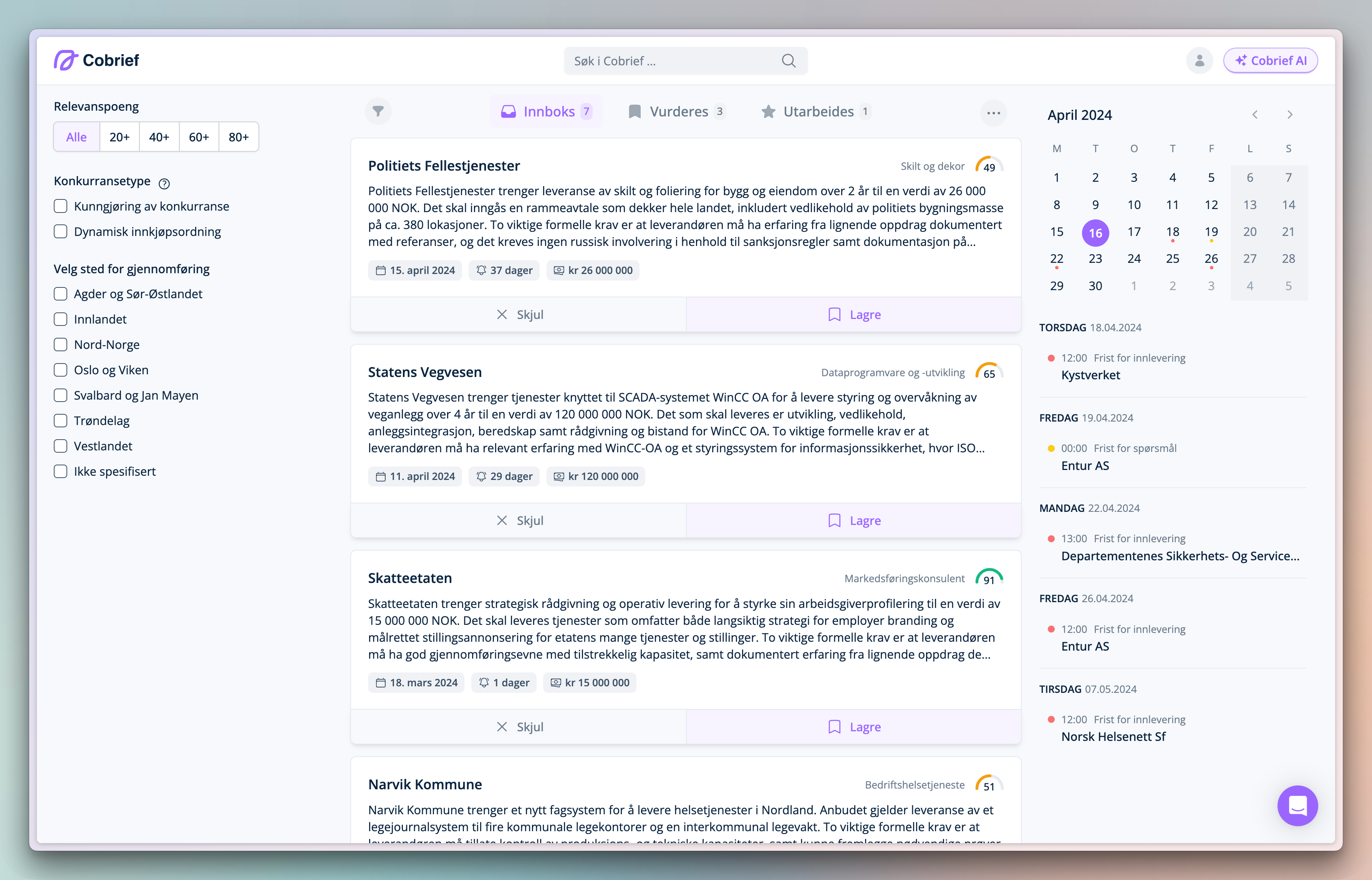
We have refreshed our identity and website to communicate more clearly who we are and what we deliver. Cobrief is an AI-powered tender tool for those who want to spend less time responding to public tenders.
New identity and website 🥳
We have refreshed our identity and website to communicate more clearly who we are and what we deliver. Cobrief is an AI-powered tender tool for those who want to spend less time responding to public tenders.
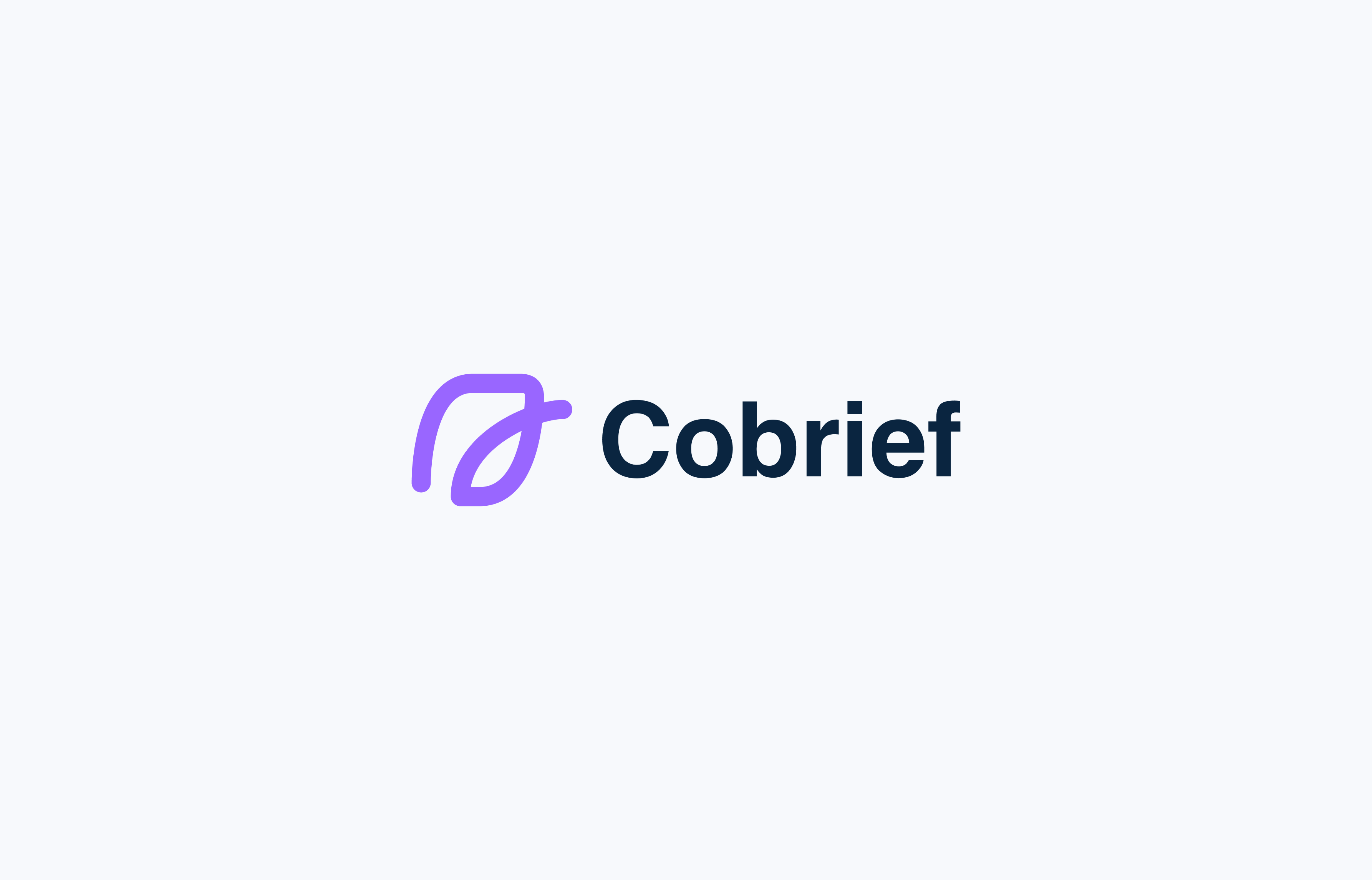
As a SaaS company, visible on digital platforms with large size variations, we wanted a logo that combines typography with an independent symbol. The symbol includes "Co" (together with the rest of the letters in the name, with a bit of creativity) and represents a framed context, which is central to our product. Furthermore, the symbol is an extension of the "typewriter" icon we have in Cobrief, where the AI uses it as an indicator when writing, and we "stream" the information.
 "Co" as a standalone symbol.
The symbol can also be divided into three pen strokes, reflecting that the steps in Cobrief are often divided into three parts, and that you can reach all parts of the system with a maximum of three clicks. Finally, the symbol offers many creative possibilities, such as animations and division with different color shades -- we have many exciting ideas for the future.
 The Cobrief logo inside the product.
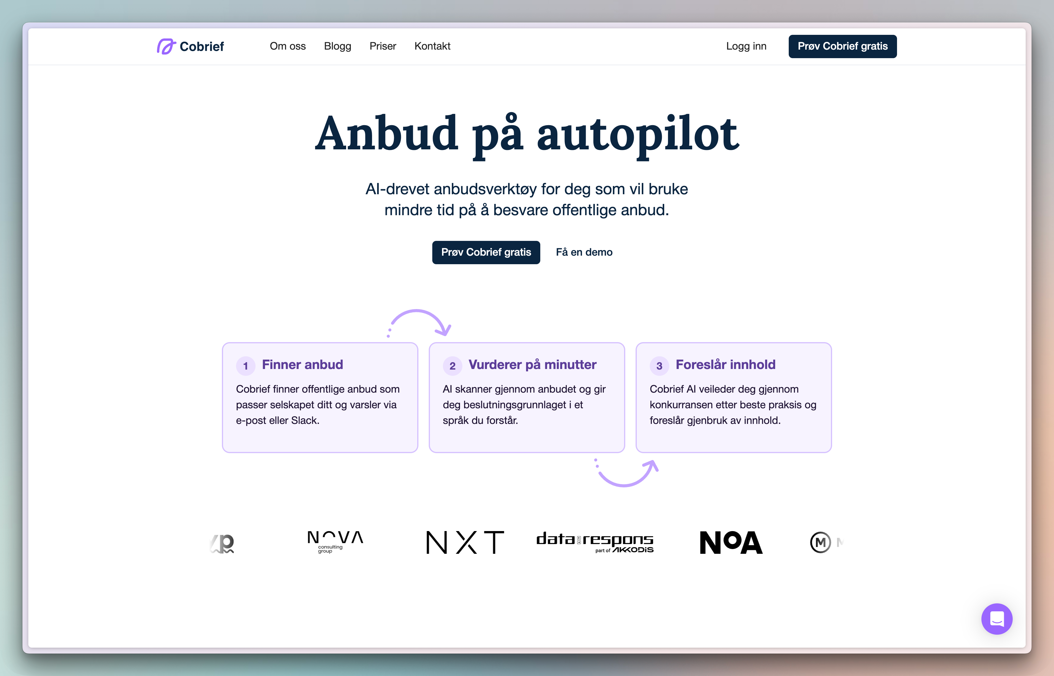 The Cobrief logo on the website.